Ten best landing pages in 2022
Are you looking for the best landing pages?
Designing a good landing page is tough. It is more complicated than it looks. You need to get so many things right: the design, the copy, the images, the structure, etc. Here is the list of the ten best landing pages in 2022. We have compiled a list of the best landing pages for you to determine what works best.
The good news is that you can apply and make/edit your landing page with these great ideas.
Let’s dive into the understanding of landing pages.
What is a landing page?
A landing page is a digital storefront where visitors ” land” after clicking an ad, promotion, or search result. This place allows you to “gather” the information and “make contact” with them. Most people often think of a landing page and homepage as the same. Landing pages don’t replace your homepage. Nor are they another page on your website.
The website or home page is more about your information while landing pages are for a particular audience with a specific conversion goal.
One page = One purpose
A landing page captures your information through the contact info, which is called a lead form. They are specially designed with a single focused objective – known as a Call to Action (CTA). A “Call to Action” can ask you to register for your webinar and download an e-book or a tip sheet.
A good landing page is going to change the course of your business. So, creating a landing page that directly contacts your customers is a tough challenge. Heightened attention to conversion optimization makes landing pages one of the most important marketing tools your business can utilize.
Essentials of a landing page
1. Unique Selling Proposition (USP)
Your competitors are everywhere; you must bring something fresh and define yourself. What is about your product that is different from the next one? You need to deliver this to your prospect concisely through your landing page.
A good example comes from KFC: “Finger-licking good.” The USP can be broken down into different parts and collectively tell them the story of your offering.
2. Main Headline
Whatever you will put on your headline will be the determining factor for a prospect to stay or leave your page. Make sure that your headline delivers your message.
For example, if you give discounts using PayPal, your headline could be ” Higher discounts using PayPal.” Catchy titles are fun and click-enticing. If the message is off the title, it can leave a sour taste with low conversion rates.
Tips:
- Use consistent headlines across the page.
- The headline could go up to 70 characters.
3. The supporting headline
Your headline cannot deliver all that you want to tell. So, to support your headline, you will need a subheadline. It is also another way to keep your headline short and sweet.
Tips:
Continue it with the headline and give a complete message.
4. The reinforcement statement
Not all your visitors are knowledgeable about you. They will scan your page and want to know more.
The reinforcement statement is another title that drives the purpose of your page. It sits halfway down your page and serves as a mid-experience to your visitors. It is like a second headline to your page.
For example:
- Headline
- The easiest way to Build, Publish, and Test a Website without IT
- Reinforcement statement
- Create beautiful websites with no HTML
5. The closing argument
Now, you have one final chance to deliver your offer. The closing argument is the final statement to back up your main value.
Note: For a short page, it isn’t required as your headline is still visible.
6. Images
‘A picture is worth a thousand words.’ A visual representation of your offer can help increase the conversion rate. Use it wisely for maximum effect. Any photo or video that you upload should show the context of use.
7. The benefit
A landing page should always answer the prospect first. A prospect always searches for the benefit. Try to explain, “What will this do for me?’.
Use bullet points to show the benefits. Keeping a balance is essential. You should not get into much detail as your page will look text full, but you should also get to the point. Remember, you need to communicate the benefit of your offering.
8. Social Proof
Social proof is a compelling concept. It proves that other people believe in you and your product/services. People always feel secure on social proof.
The concept is that the conversion rate with social proof is higher.
Some of the widely used social proof are:
- Customer testimonials
- Social signals
- A number of your customer
- Rating stars
- Customer reviews
9. Call to Action
A ‘Call to Action’ is the term that delivers the page’s purpose to you. It can be presented in a button on a click-through page or as part of a lead generation page. The essential considerations are the design of your CTA, where you will place it, and what it says.
Be creative and make your CTA clickable. A good CTA is like good food that everybody wants.
10. Scarcity
People crave scarce things. Scarcity in a landing page means giving a deadline. Set a timer, set a date, or set a limit. From the beginning till the end, mention and remind them what they may be losing. For better results, place the CTA near the place you create scarcity.
10 Best Landing Pages of 2023
Forbes Magazine
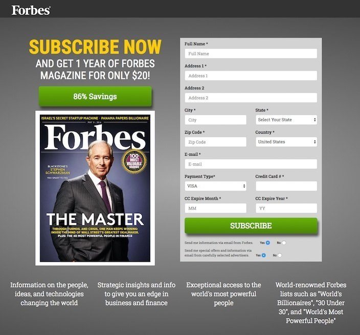
This picture shows marketers why Forbes has one of the best landing pages you’ll find online.
Well done:
- The header and subheader reach the benefit of signing up for Forbes Magazine.
- The (86% Savings) attracts visitors.
- The footer tells visitors what they’ll find inside the magazine.
- The color of the CTA button pops off the page.
What could be tested:
- A clickable logo can divert visitors to another page.
- The “Subscribe” call-to-action could be better tailored with “Send Me a Year For $20!”?
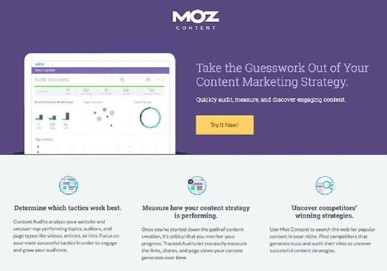
Moz Content
Well done:
- The CTA button color contrasts with the purple wall.
- The “Try it Now!’ CTA tailored to the offer.
- The title clearly states the benefit.
- The page is clean, making it easily readable.
- The page is not text-heavy but gives adequate info.
- It is a responsive page, meaning it will display on any screen size well.
What could be tested:
- A clickable logo can escape the prospect off of the page.
National University
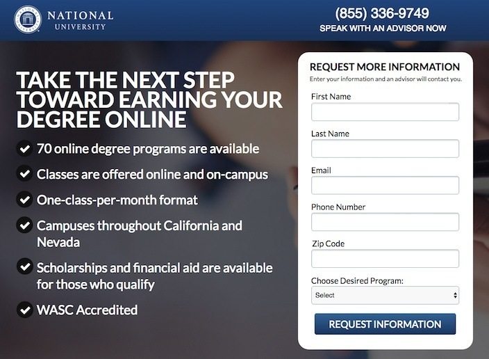
Well done:
- They have contact information. It helps people to reach out to an advisor.
- The title conveys relevant information about National University.
- Bullet points quickly carry the benefits of choosing a National University.
- The “Request Information” CTA tailors the offer.
- A responsive landing page.
What could be tested:
- The clickable logo escapes users off the CTA.
- The paragraphs could be broken into smaller lists.
- The CTA button color is similar to the header. The CTA button should have a unique color.
Noah Kagan
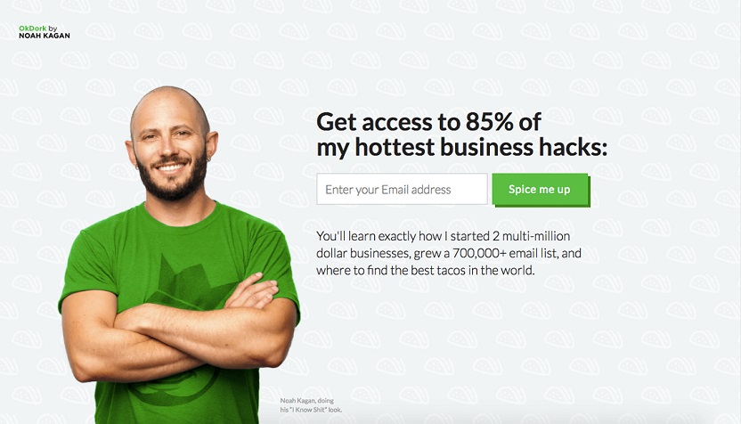
Well done:
- With minimal content, this landing page focuses on taking the only action available – signing up.
- With the likable image of Noah and the harmonious color, the website is clear.
- The green CTA button attracts visitors.
- The content clarifies the prospects about the benefit and what they expect to learn.
- Proper use of testimonials makes the prospect feel secure.
What could be tested:
- What does 85% of my hottest business hacks mean? Try giving clear and direct information.
- The font and kerning on the paragraph “You will learn……………” could be made more apart and broader, so it is easier to read.
Masala Body
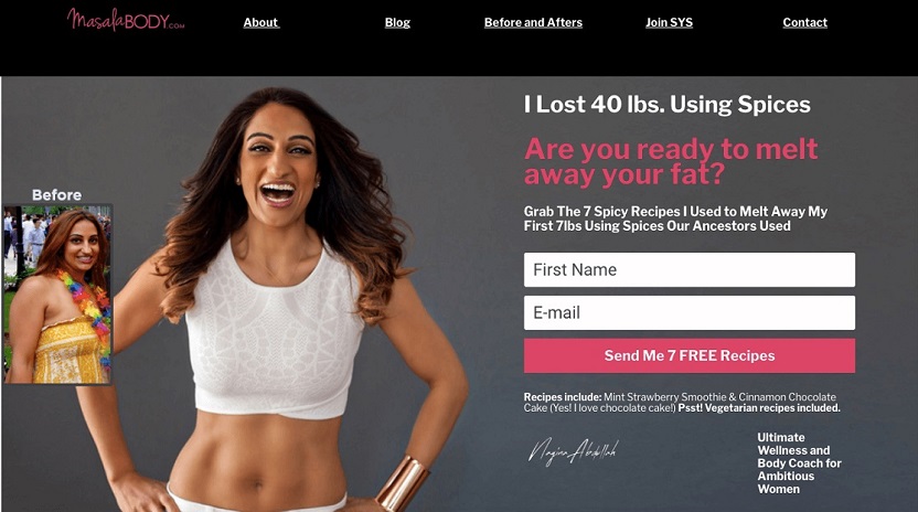
Well done:
- Once you open the page, you are direct and straightforward to the offer.
- The before and after pictures is proof. It demonstrates she knows what she is talking about.
- The word “Free” is attractive.
- The brand and recipe support Nagina has been featured in Forbes, Huffington Post, and Time.
- It handles the objection by explicitly stating that the prospects can eat their favorite food.
- The page completes with a good summary of Nagina and the testimonial.
What could be tested:
- Two offers on a single page can divert the prospects from one specific proposal.
- The header feels unappealing with the whole page.
- A quote from other doctors and experts could reinforce the validity of Nagina. I would prefer not to use them.
Louder online
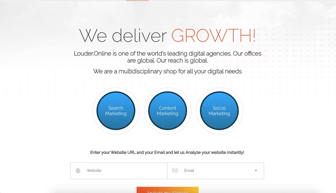
Well done:
- Great proposal. Instead of giving an ebook like everyone, it offers a free analysis tool. This is preferable.
- The big blue CTA is unique and conveys what they actually offer.
- Brand names help provide social proof.
What could be done:
- The 1st page should be more focused on the prospect. Use You instead of We. Readers want to know How you can help them, then who you are.
- A video would be more effective rather than the image of Neil Patel and Aaron Agius.
Landing Folio
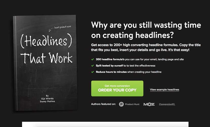
Well done:
- Targeted headline.
- The subheading solves the problem of prospects.
- Right color combination (Green on black).
- Bullet points give distinct info.
What could be tested:
- If creating headlines was a waste of time, then why would anyone need this product? This could give a negative message. They need to pick one market that connects to the problem.
- Today, many free headlines claim to convert by trusted sources. It has nothing special. In my point, it needs a USP.
- The page lacks proof. A quick explanation of their experience and two testimonials are not trustworthy. A shred of more significant and result-related evidence is needed.
- Give me a picture of how my life would improve after this product.
Match pool
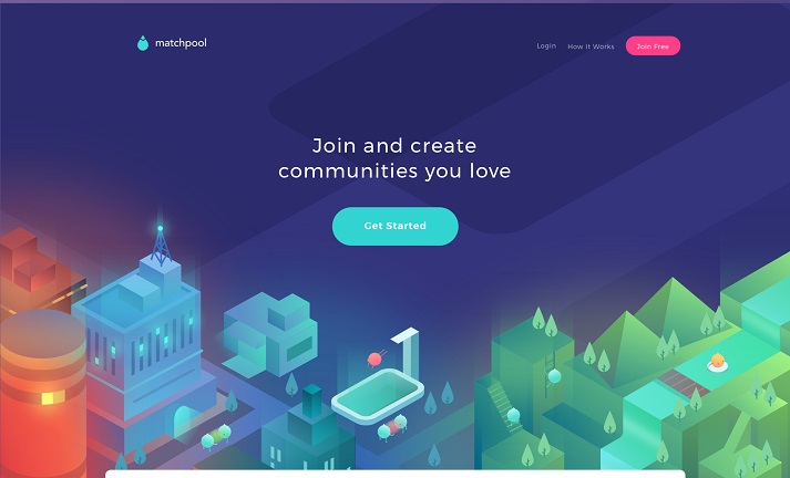
Well done:
- The flat design of the page is fresh and lively.
- Minimalist copywriting indicates they are free to create their own community.
- The bright color of CTA is catchy.
CodeFights
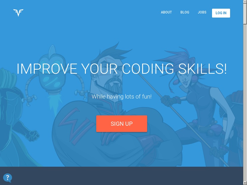
Well done:
- The sleek blue-colored design looks impressive.
- You will find this amazing animation that showcases different Heroes of the site.
- The large CTA button with red color implements people signup right away.
- They didn’t show much on the platform as the challenge process continued. If you’re a programmer, you’ll know what will happen next. This is the charm of a landing page.
Flickr

Well done:
- Flickr is a photo-sharing or storage platform. The picture carousel on their landing page showcases their user photography.
- The large CTA button draws the prospect toward the Flickr community.
- The artwork and the artwork’s signature make the prospect more curious and can’t help going further.

